Product Design Lead (Design System)
March 2020 – November 2021
Leading the creation of a brand new multi-brand design system ‘Loop’ for the largest telecoms group in the UK.
Just so you know: This case study is intentionally limited in scope because the design system is not public.
Big wins (for the team):
- Created a headless design system that retained the individuality and personality of each BT brand (BT, EE, Plusnet).
- Migrated hundreds of designers and engineers to a brand new system and ways of working.
- Used the Design System to connect previously siloed areas of the organisation.
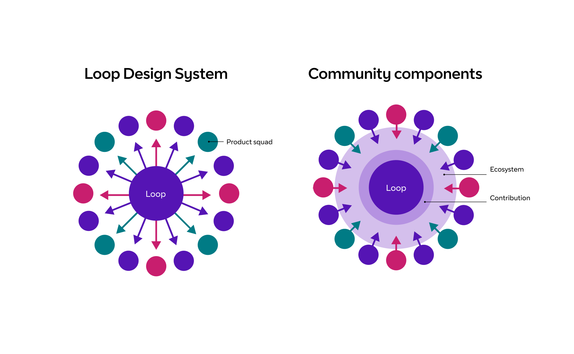
- Developed a community “component blueprints” library as a way to share and iterate on component and pattern design before design system contribution.
- As an Accessibility Guild member, I increased knowledge of accessible interface design within the design community.
The background
The BT brand had just been revitalised. EE had a design system but it had become bloated. Plusnet, an acquisition, was operating well as its own separate entity.
The technical landscape was wide, and the organisation was siloed between commercial and retail as well as design and technology.
The organisation required certain things from the system which shaped the direction:
- Each brand was truly unique - The system had to allow for stylistic independence of each theme.
- It must technically be able to support React, Vanilla HTML/CSS, and Web Components.
- Common patterns, behaviour, and structure should be unified.
- Consumers of the system in each organisation should feel like it’s been built for them.
- Unlike a lot of multi-brand systems, it was not hugely important to be able to switch any customer journey to a different brand instantly.
The process
At the start of this journey, I worked a lot with Measured. Collectively, the team came up with a design system approach that balanced the needs of the brand and the organisation's technical strategy:
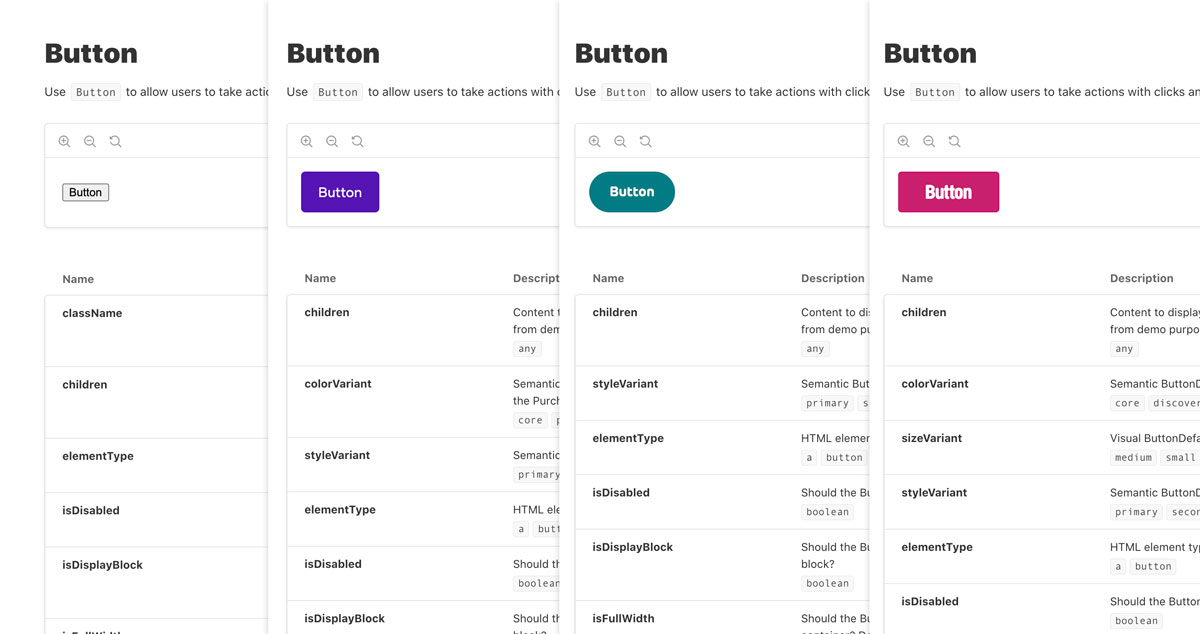
- Components having a universal "Behavioural API" and a brand-specific "Style API".
- React would be a build tool for HTML.
- Styling would be handled by vanilla CSS.
- There would be a mix of universal and brand-specific tokens.
Let’s dig into a few of those things a bit deeper.
Behavioural API and Style API
The concept was to do something similar to what we might now call a "headless" component. The HTML structure, the props that control the technical and functional concerns, and any common variants would all be handled on a base, unstyled component.
The Style API would extend the base component and add brand-specific props. For example, this meant rather than abstracting colours and weights in props like "brand-1", we could be more literal and descriptive like "yellow".
Doing this meant the organisation got the benefit of shared structure and functional behaviour, while consumers of the system in each brand felt like it was designed just for them.
React as a build tool with CSS
The organisation used React as their frontend library of choice for customer journeys and accounts. This wasn’t something we could influence, but we could make it more universal.
Because the system needed to support React, AEM (HTL) templates, Web Components, and more, we used React as a way to define the scope of the component and what styles should be applied in each configuration. Rather than using a CSS-in-JS approach, we opted for Vanilla CSS with semantic classes.
This meant, while a product team building a React application could use the components directly, there was always an option to use the transformed HTML and CSS directly or as a way to template in other languages.
Setting up the foundations
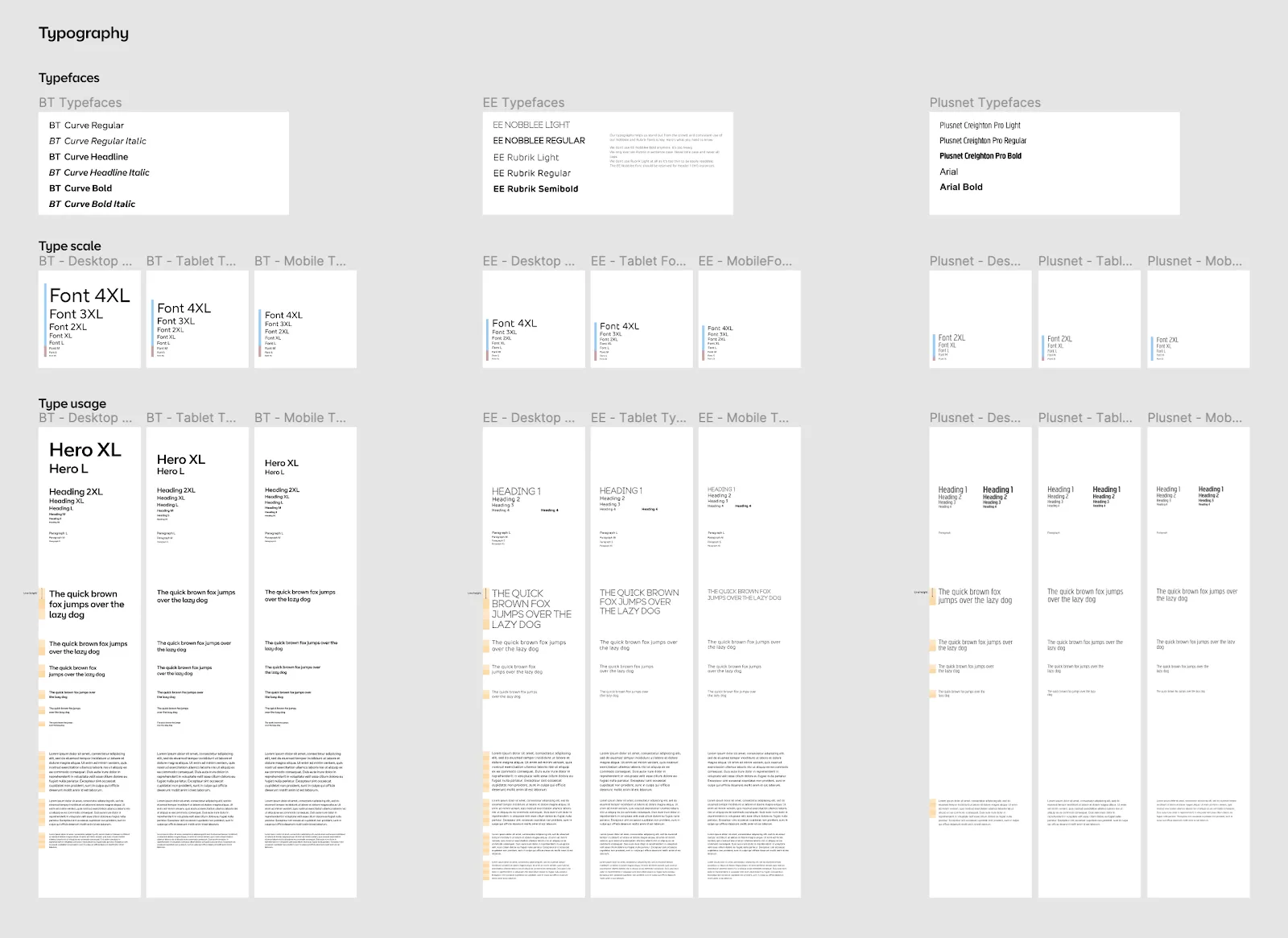
As with any design system, we needed to understand the needs of each theme, where they cross over and where they need to be different.
We ran audits of the usual suspects: typography, colour, spacing, and layout, to define the requirements for each theme.
Bringing accessibility to the forefront
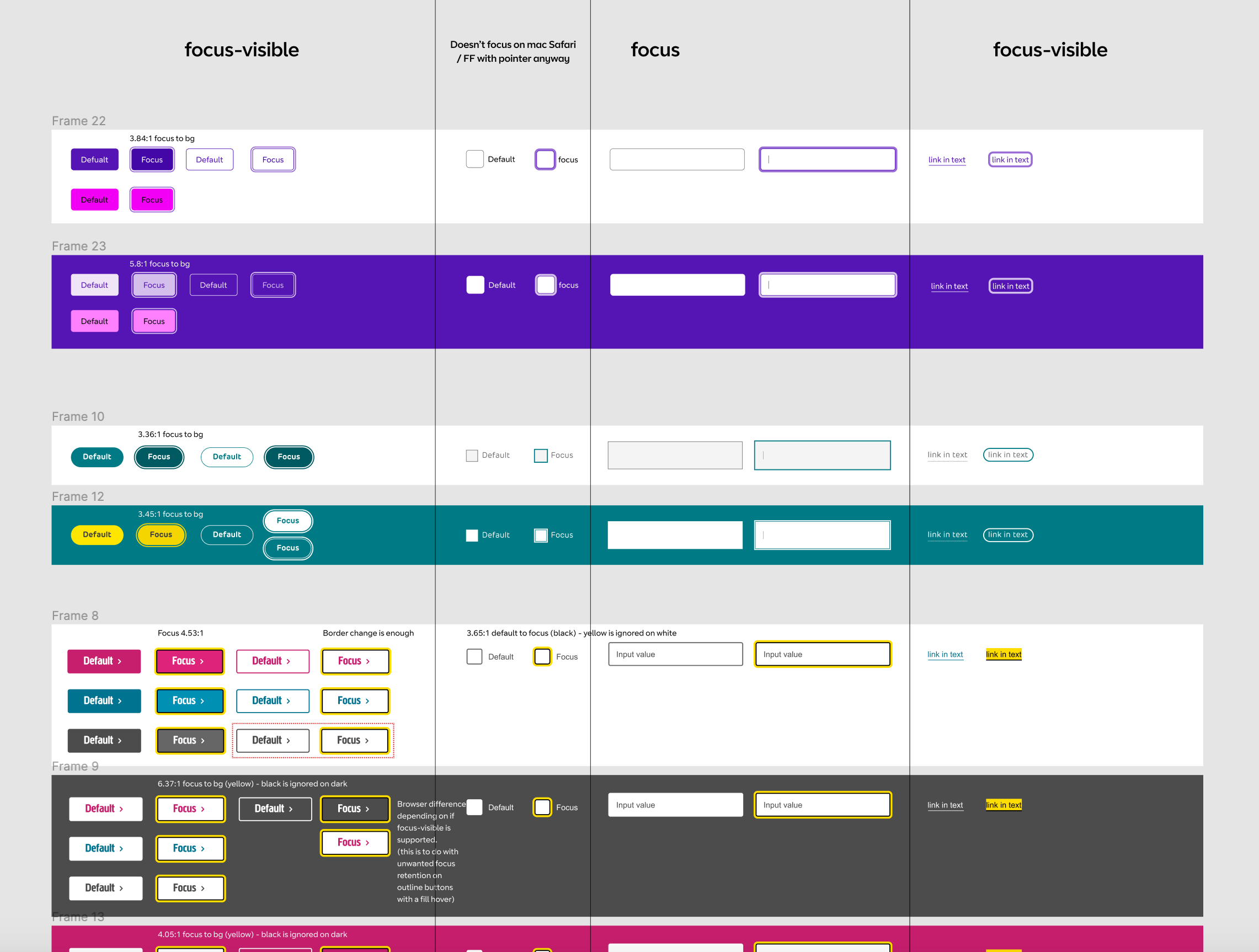
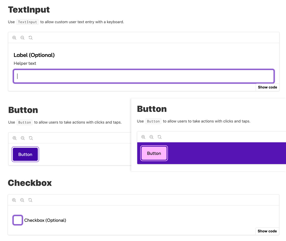
During the audit, we found that although some areas of engineering were mature accessibility-wise, we needed to dig into the design of a lot of foundational elements to make sure they had adequate focus indicators and met WCAG 2.1 Non-text contrast.
This meant essentially redesigning all focus states for all brands, based on the varying colour combinations.
Community mindset
If you have a design system for more than a day, consumers will ask how they can contribute to it. The reality of this is extremely complex. One of the original problems we were trying to solve was related to the effects of bloat from contribution being a requirement of the previous system.
We set up a community components library, a place to share work and be the proving ground for new designs. The expectation was that we could solve 90% of the issues relating to duplication of effort, encourage debate and awareness of similar work, while not affecting the integrity of the central system.
This is a model that has since been adopted by multiple organisations, and something I've taken with me elsewhere.
